Major Project Time
Wednesday, 18 May 2011
Thursday, 21 April 2011
Tables Tables Tables!! Ugh!!
After many, many, many different tables I've finale decided the easiest way to show the schedule for the festival was by separating them into each day instead of by venue or theme. I'm happy with the layout of these I think its very clear and easy to understand for the user, and I've carried through the colour theme from the date that I've used throughout.
Booklet Cover
I want to keep the cover simple, I'm afraid its a bit dull looking though? Would you pick this up? Hhmmm?
Maps
Derry Maps: Very little to look at in regards maps from Derry City.
Other Festival Maps
Here are some lovely maps by a woman called Lena Corwin. I love the simplicity in the maps, they're clear and easy to read. The maps are a the mix of accuracy and fantasy. Each map is drawn very precisely, with roads and points of interest, but Lena takes an artistic liberty in changing aspects, like the colors and style, to her liking. Ten maps have an accompanying interview with a shop owner from the city.
Monday, 4 April 2011
Sneak Peak
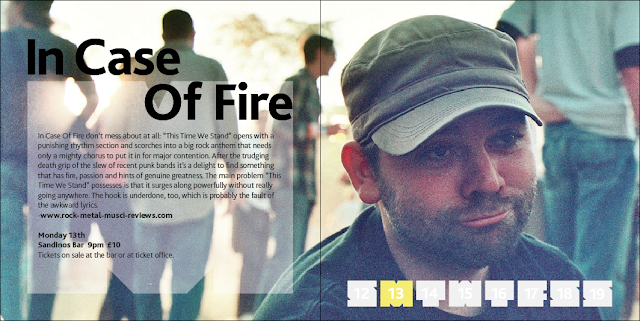
Here is a look at a few of the layout I've been working on, I think every event will get a double page spread, this way its not too cramped and the photography doesn't get lost in all the information. I'm trying to have a strong design style throughout the booklet and keep it quite consistent but still changing something in every page so it doesn't all look the same. So far I'm quite happy with the layouts, they booklet is going to work out at over 120 pages...eek!!
Paper Sizes
Looking into paper sizes and what would suit my booklet. I feel standard paper sizes are just not going to cut it, I think they would just be too traditional. After my research I felt the best thing would be actually cut up paper to the different sizes so I could get a better idea of the size and a better feel for how it would look in the end and which size feels right in my hands. I have definitely decided I want to stick with a square format for the booklet. I want this booklet to not only be a source of information for the festival but also I piece of art work in itself that someone would hold onto.
Above is 10x10, (20x10 double spread) post it size, far far too small, I've shown in all of these pictures what the double spread would look loke
13x13, 26x13 (double spread) Still think this is too small, the type would have to be tiny and everything would just look too squashed.
14x14, 28x14 (double spread)
15x15, 30x15 (double spread) I think this is it! It just feels like a good size, would be plenty of space and I feel my photography would look nice within this size.
Subscribe to:
Comments (Atom)


