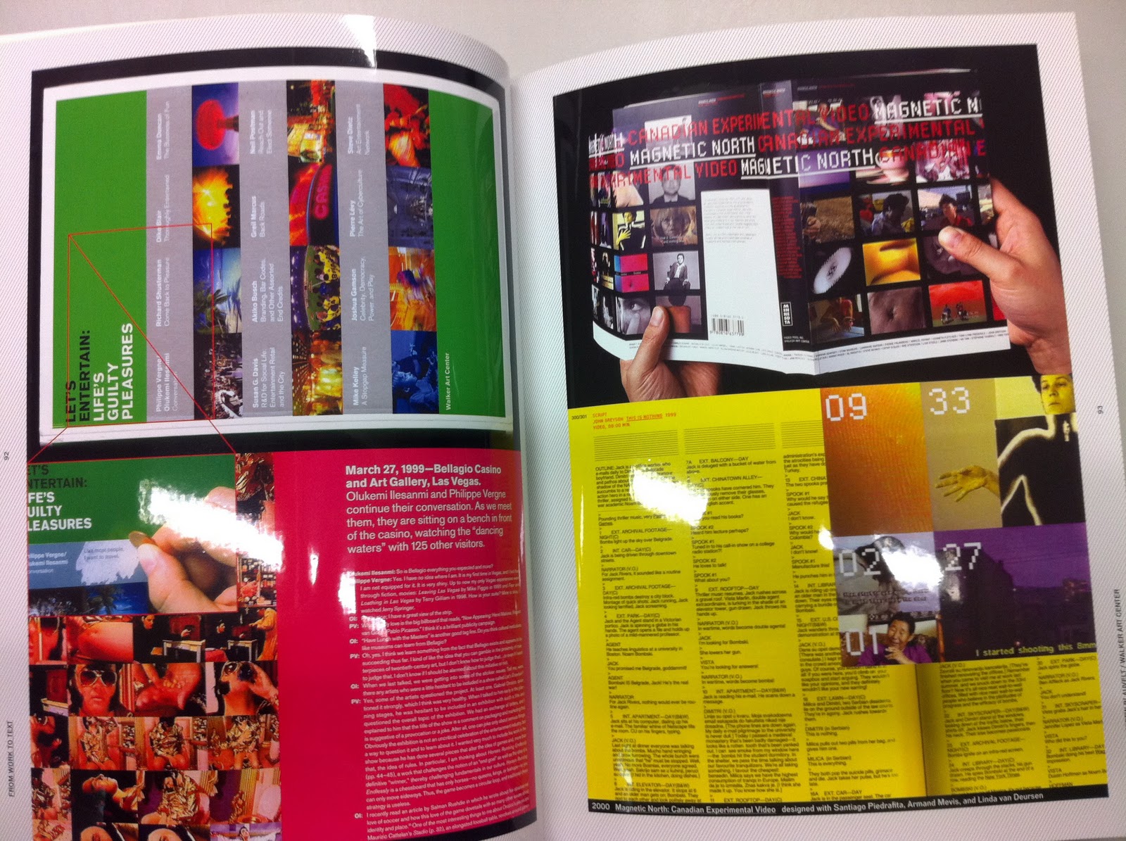
Here are some interesting photos I took from the Japanese Journals in the Library. Not entirely sure how relevant it all is too my work but I found them extremely interesting and defiantly worth the look. There is so much going on in these journals it's hard to get your head around. The graphics, layout and typography are all very different in each one and visually very stimulating. They have broaden my ideas of what is possible within print. From the types of paper used, transparent, super high gloss, offset etc. To the different types of fold outs, which is something I really need to concentrate on because my booklet is quite small but the timetable for the festival is hugh so need to work out a neat little way to fit it into the booklet without making the type 2pt!


Interesting foldout but I think this is too awkward, especially if you think of my target audience and how they will be using the booklet, probably a tourist around town imagine trying to fold and unfold this while trying to find out where your going.


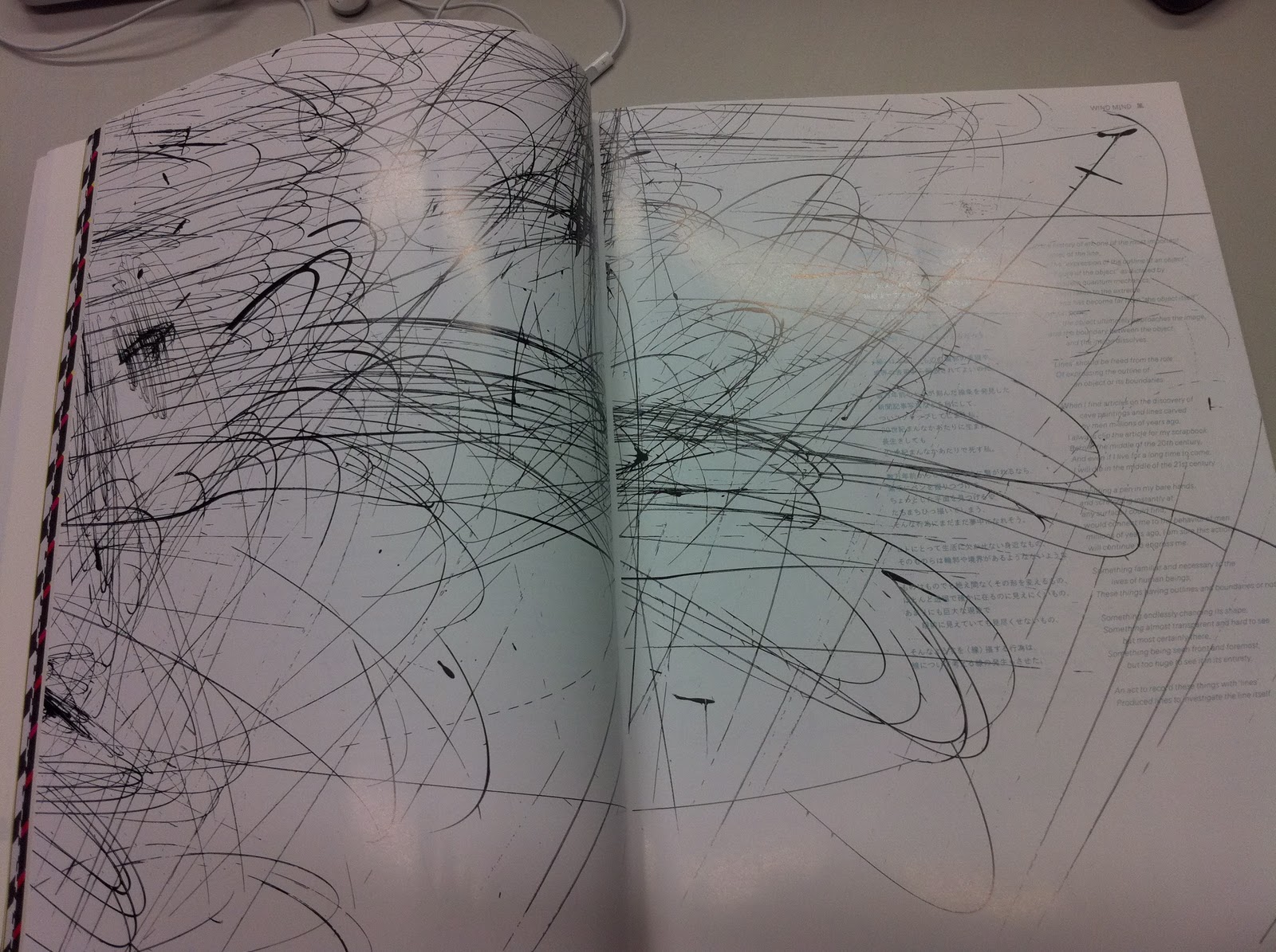
These two pages above are really lovely they are slightly transparent and the image builds up to create one whole image, a really nice effect.
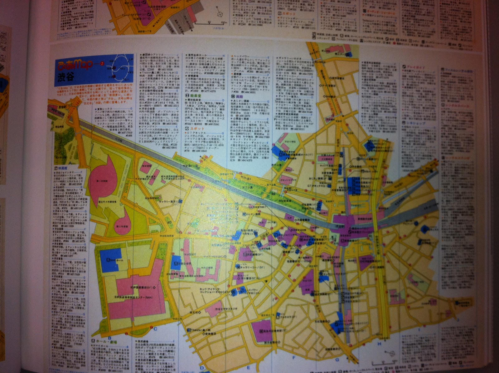

MAP! One thing that keeps slipping my mind I need to do a map of the city to show all the venues, need to get onto this asap, I feel it's going to be really complicated and time consuming.


More interesting folds.


Not only is the work above really interesting because of its graphic work, which I really enjoy but I'm quite surprised about how much I liked the gloss on the paper. Usually I would steer clear of gloss paper as a rule but I think I liked this paper because it was super gloss almost reflective. If your gonna do something, go all the way with it!


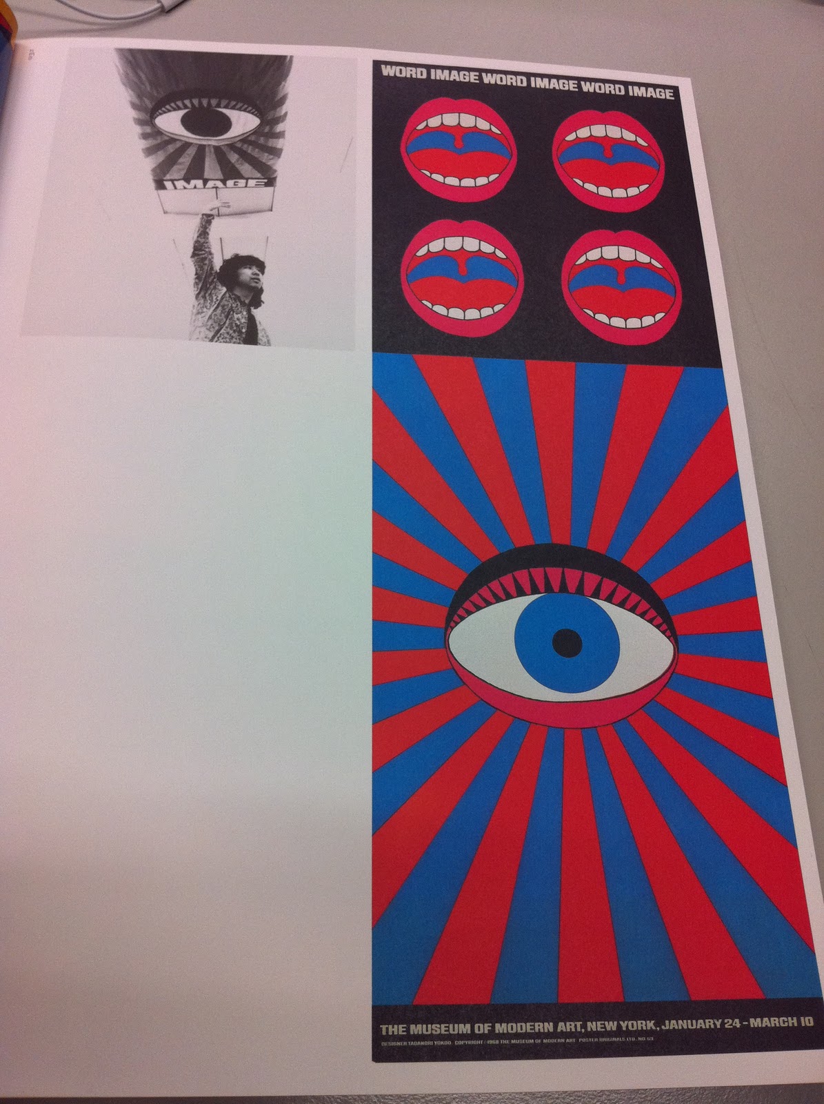


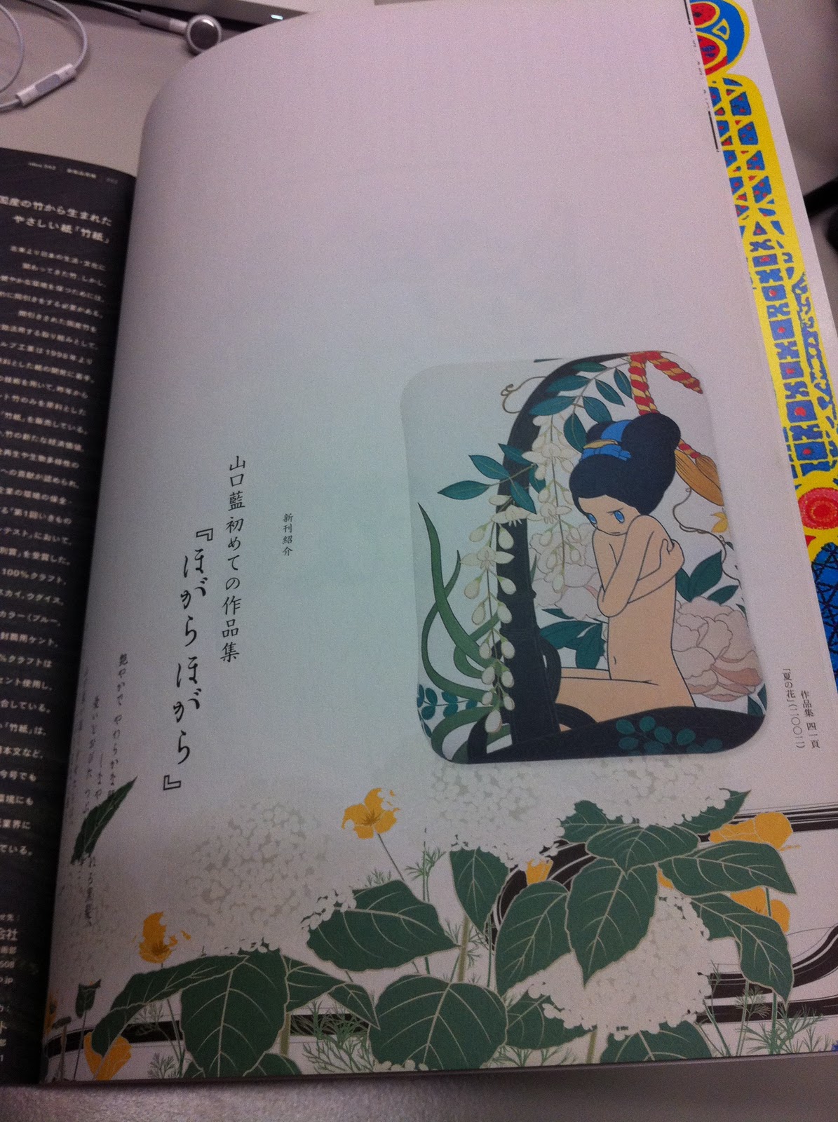


The illustrations with in these journals vary so much, they're a bit crazy but I found this really engaging and visually stimulating, I just wanted to keep looking and was snap happy as you can see!


Really liked this idea of a booklet within the journal, I've seen this before in Design week I think. I think it's a really nice and effective way to exhibit different types of work but still keep it as part of the journal or a tear away that you keep separately.


The typography in the few journals I looked at was inspiring, I found it so appealing. Which worries me I feel I'm playing it too safe with my typogrpahy???
No comments:
Post a Comment