Derry Jazz Festival
This booklet is nice and clear but a bit simple. It's A5 which I feel is just way to big and the text inside in huge 12pt if not more but thats usual for these kind of city council/goverment documents, it's to do with the regulations for visually impared. I wonder is this something I should/need to worry about? They have clearly sticked to the three basic colours from their logo which is good and works well.


Glasgowbury Festival
This booklet is nice and small, slightly smaller than A6. The layout is very clear and uncomplicated they just give you information on each act, nothing about the times or areas within the event. Nice use of colour.


Transpose Belfast
I love the type on this leaflet and the photograph on the front cover. Quite similar to the type of work I 'm doing. Nice use of 3 main colours on black and white photographs.


The Playhouse Derry
Again another straightforward booklet, I think because of the amount of information needed in these types of booklets the layout needs to be clear and concise. You want the public to pick this up and find what they are looking for easily.


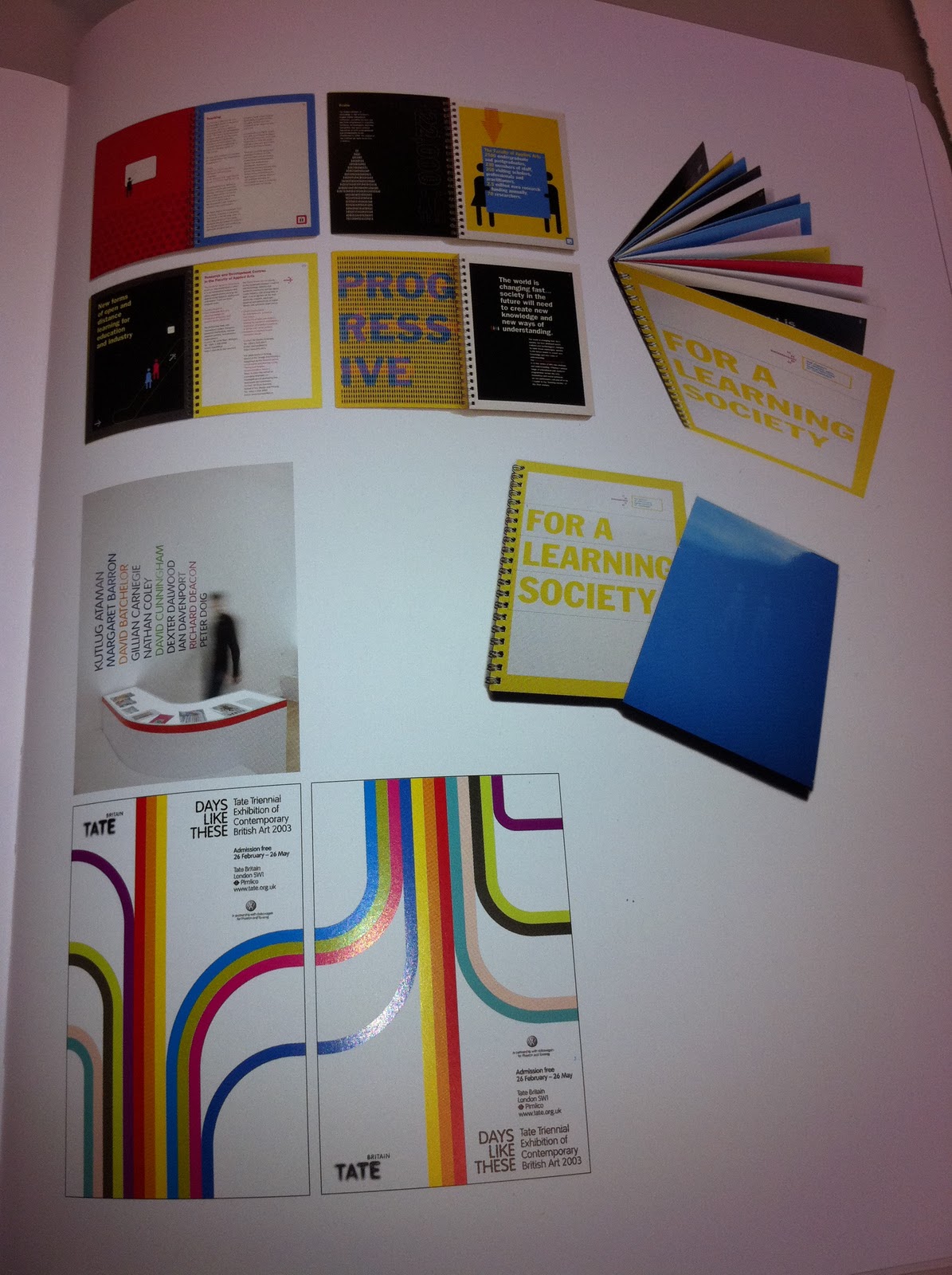
Ulster Festival of Art and Design
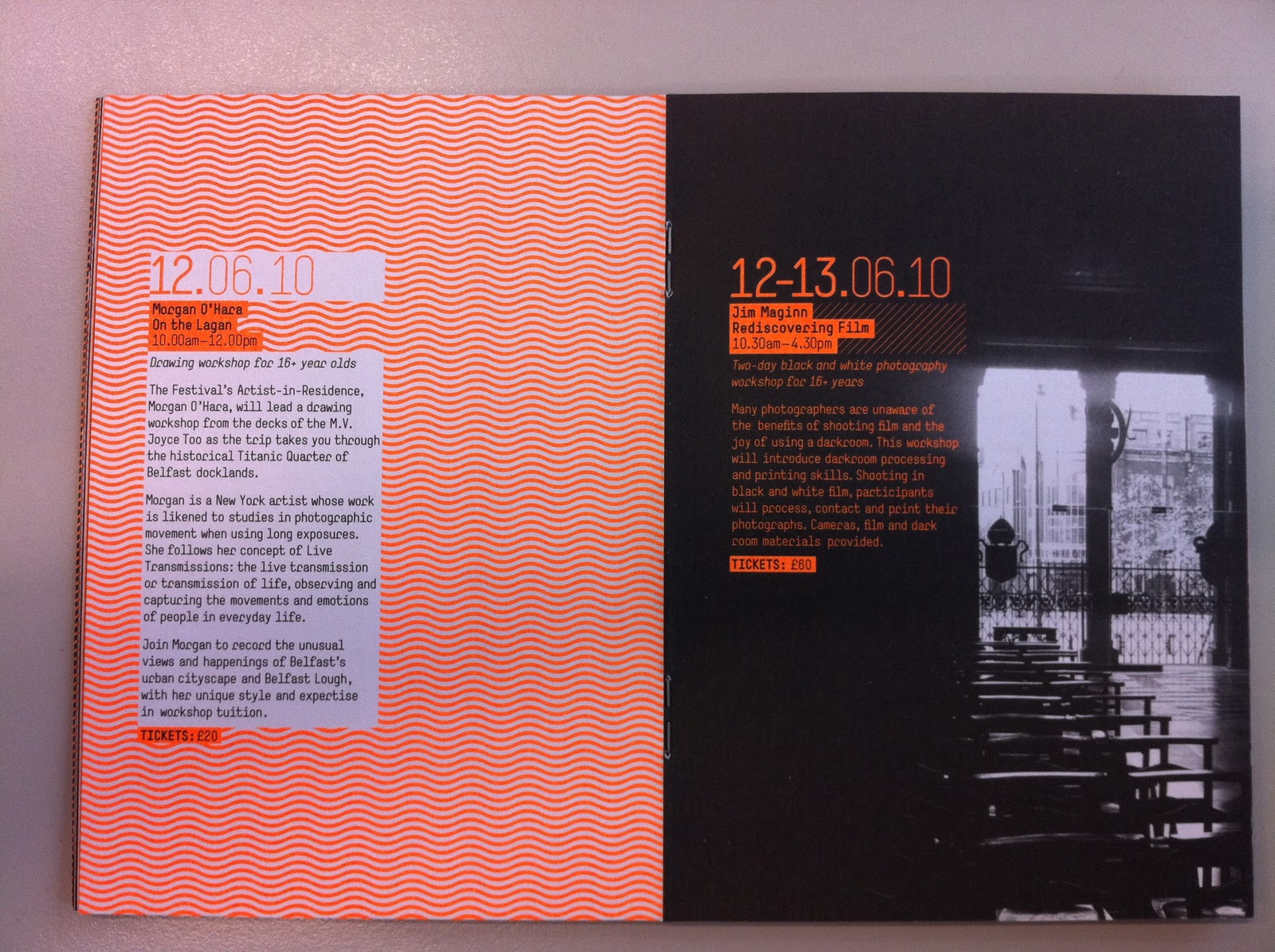
I quite liked this one, however, because of the highlighter orange they choose some of the text was quite hard to read and some of the graphic elements I found hard on the eye to look at! But apart from that I thought it was quite a pleasant piece of design work. The only other thing that concerned my was that it was the Ulster Festival of Art and Design for the University of Ulster, well how come last years design show wasn't mentioned? I know all the events in this were in Belfast but as a part of the University of Ulster I feel we should have been included in this.


The Cathedral Quarter Arts Festival
I really like the shape, size, and layout of this booklet, every page is not the same but there is a cohesiveness to the layout with the use of photography, block shapes and the type. I really think it works really well, the front cover is glossy which I'm not too fond of but the offset paper inside is lovely.


Walled City Market Flyer