
Because of the look of my 'dated', 'aged' photography I'm trying to find a balance between them and a modern style of design that I want to incorporate into my work. In the book above "New Retro" it talks about different types of design style, one of which is "The International Style"(see poster below). The visual elements of this style are said to be:
-motivated by objectivity and clarity in the presentation if information
-adherence to typographic grid with emphasis on a vertical/horizontal axis
-sand serif typefaces such as Akzidenx Grotesk, Univers and Helvetica
-large headlines running vertically or diagonally
-narrow columns of body text, ranged to the left
- photographic or geometric technical imagery

Armin Hofmann, Giselle, poster, Municiple Theatre, Basel, Switzerland, 1959
"Art Deco and American Moderism"
visual elements:
-decorative and luxurious
-abstract Imagery
-geometric shapes and images
-use of motifs based on industrial forms, on speed or travel an on ancient Egyptian art
-Vibrant colour combinations, and large blocks of solid and grauted colour

P22 Font Foundry (by Dave Farey and Richard Dawson) , Johnston, 1999, typeface based on Edward Johnston's alphabet for the london underground.
Linotype's Broadway, typeface based on Morris Fuller Benton's original of 1928.
"The New York Style; corporate Identity"
visual elements:
-concept driven approach often employing humour and wit in a variety of styles
-playful and integrated use of type and image
-contrasts in colour and scale
-use of traditional, solid typefaces like Bodoni alongside simple sans serif and script faces
-collage, cutout-style illustration
-colour photography with high saturation value

Ivan Chermayeff, cover of the Wisdom of the Heart by Henry Miller, US, 1959
"European Modernism and the New Typography:
visual elements:
-aimed to be objective, rational, universal, functional and efficent
-use of all upper- or all lower-case letters, and san serif typefaces based on geometric forms
-asymmetrical imagery and pure geometric shapes
-primary colours, often one primary colour with black
-letterpress, photography and photomontage

Piet Zwart, spread from NKF, NV Nederlandsche Kabelfabriek (catalogue for the Dutch Cable Factory), the Netherlands, 1928

Jan Tschichold, Konstructivisten, poster, Switzerland, 1937
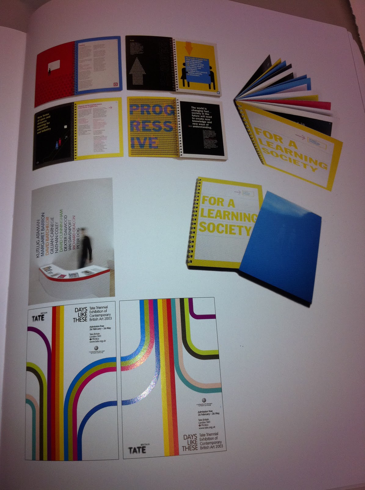
Below are recent designs that have brought together the visual elements mentioned above, this is essentially what I want to do with my work, use some of these element and combine them in a way that works both visually for myself as a designer and works in communicating the information in an aesthetically pleasing way as well as communicating the information in a clear, concise manner.


I'm thinking to really make the most of my photography and not let it get lost in all the festival technicalities I might try and have a few pages of just photography dotted throughout the booklet. I think it'll work nicely also to break up all the events and make sure that the booklet isn't too text heavy.


No comments:
Post a Comment