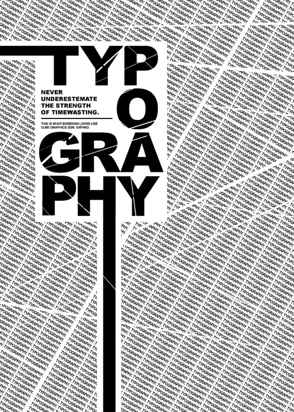
"The choice of font can do as much to convey the message of a logo or title as the words themselves.'
"Selecting the right typeface for a particular project can sometimes appear nigh on impossible"Computer Arts Project_June 2008
This is something that I am struggling with, there are just SO many typefaces out there, which one works best? When I find one I like initially I look closer and see there's something funny looking about the "r" but only when it's beside "t", am I just crazy!! Or if I find a nice type, play around with it, getting sitting all nice together and I'm happy with it I place it on an image and it awful! Why? Trial and error! But how do you know when it's right? Is it as simple as saying "It just works"?!


No comments:
Post a Comment